


zivziv
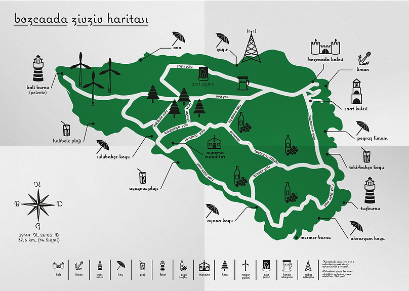
Zivziv, which takes its name from the phrase ‘zivzivlemek’, which means constantly travelling in the region, is a student and pocket-friendly brand that aims to be with the tourists who come to Bozcaada to taste the local delicacies of the island and to carry these delicacies all the way to their homes.
Student Project, 6 Weeks, 2017
 |  |
|---|
In this project, a new brand and story focused on coffee or fruit was created and a logo was designed for this brand and different packaging design techniques for different forms of products were asked to be experienced. Grapes and their complementary by-products were used in the project.
 |  |  |
|---|
In Logo Design, I tried to create an image of a footprint that I believed supported the brand story by dividing Zivziv into its syllables and deforming the letters. Since the result did not give the effect I wanted, I decided to use the design in which the syllables appeared as a continuation of the footprints.
Since Zivziv is a brand that uses natural products, I set the color that the brand will use as green, but since I need to balance the intensity of the color, I added another white-weighted option to the sandwich packaging.
In order to convey the qualities of the products, I used point in solid products and drop detail in liquids.
I combined the products sold on this eco-friendly island, which prohibits the use of plastic bags, with a cloth bag that is more durable and has a wider range of uses than a paper bag.


mood
Biscolata Mood is a brand of biscuit with different chocolate fillings in it that looks at the consumer's fortunes with meanings corresponding to the symbols found on it. This project focused on milk and dark chocolate filled versions of the brand.
Student Project, 6 Weeks, 2017


I created a story in which the biscuit with milk chocolate filling represents the day and the dark chocolate filling represents the night, and I transferred this story to the packaging with a linear and simple illustration.
After choosing colors from dark shades to capture a gothic atmosphere, I tried to capture the effect on tarot fortunes using a serif typeface. And by manipulating the "MOOD" text, I aimed to highlight the name of the product.
In the process, I learned not to stick to patterns by doing typographic experiments, and to be able to design simple narratives out of my comfort zone in my illustrations.
In this project, which was carried out within the scope of packaging design course, it was requested that two product designs of an existing brand be re-examined and a new logo was created for the brand.
The old packaging of this Biscuit, whose purpose was to read fortune, could not accurately reflect its concept to the consumer. The most important of my goals was to simplify the highly dynamic old packaging and to convey the concept of the product towards the consumer.


 |  |
|---|

